Colour and Accessibility
In web design, colour contrast is the first (and biggest) step towards accessibility.
As websites are accessed through a screen, colour contrast issues are experienced by a number of users.
Understanding how different disabilities perceive and experience colours is essential for web designers to make a difference.
Learning Disabilities
This can include autism, some forms of ADHD, dyslexia.
Soft colours are often preferred by users with learning disabilities as they are subtle, therfore less triggering and distracting.
If colour is used to convey meaning, it needs to be clear and accompanied by text.
Visual Impairments
Visual impairments affect a high proportion of the general population. Over 50s are more likely to be visually impaired than not, so this is a very important part of accessibility to bear in mind.
Red, green and yellow are hard to differentiate, so try not to use these colours together
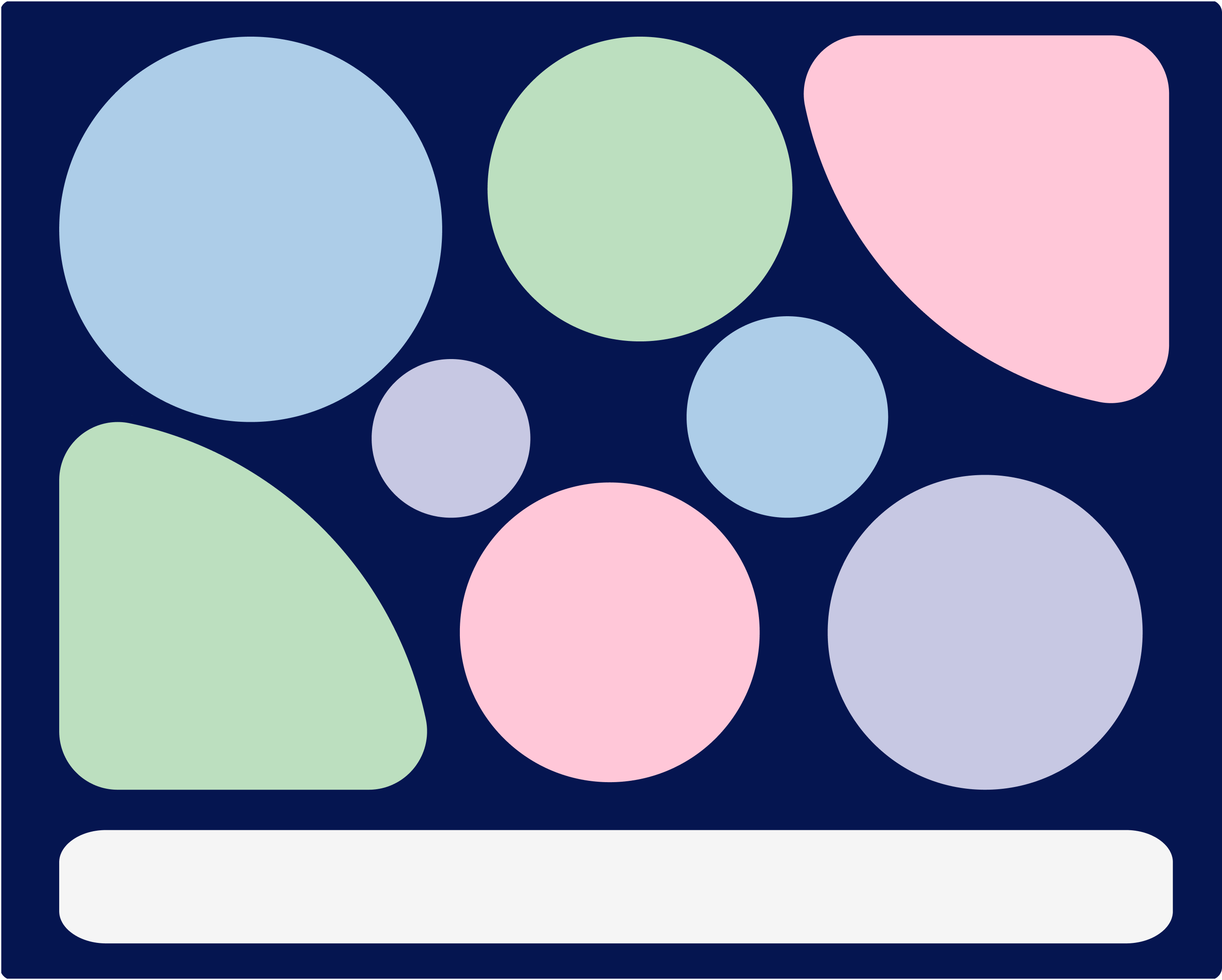
AAA Accessible
Make sure your colour contrast is high enough for all content essential to navigation.
Colours should accommodate most users.
This fits accessibility guidelines in most countries.
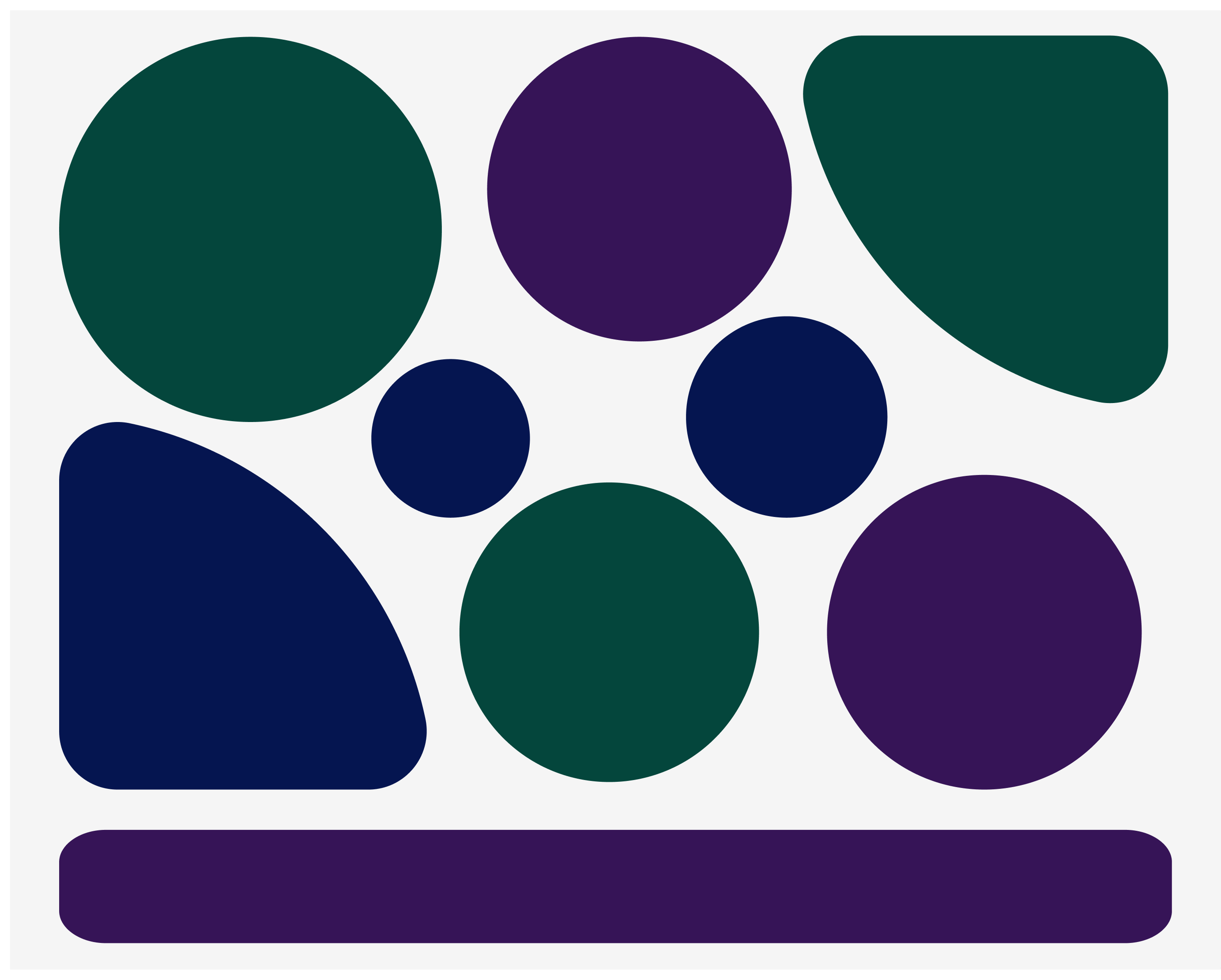
Compliances
Make sure there is enough colour contrast for smaller paragraphs.
Learning disabilities are usually not accounted for.
Some of the colours used (like the red) are not recommended for accessibility.
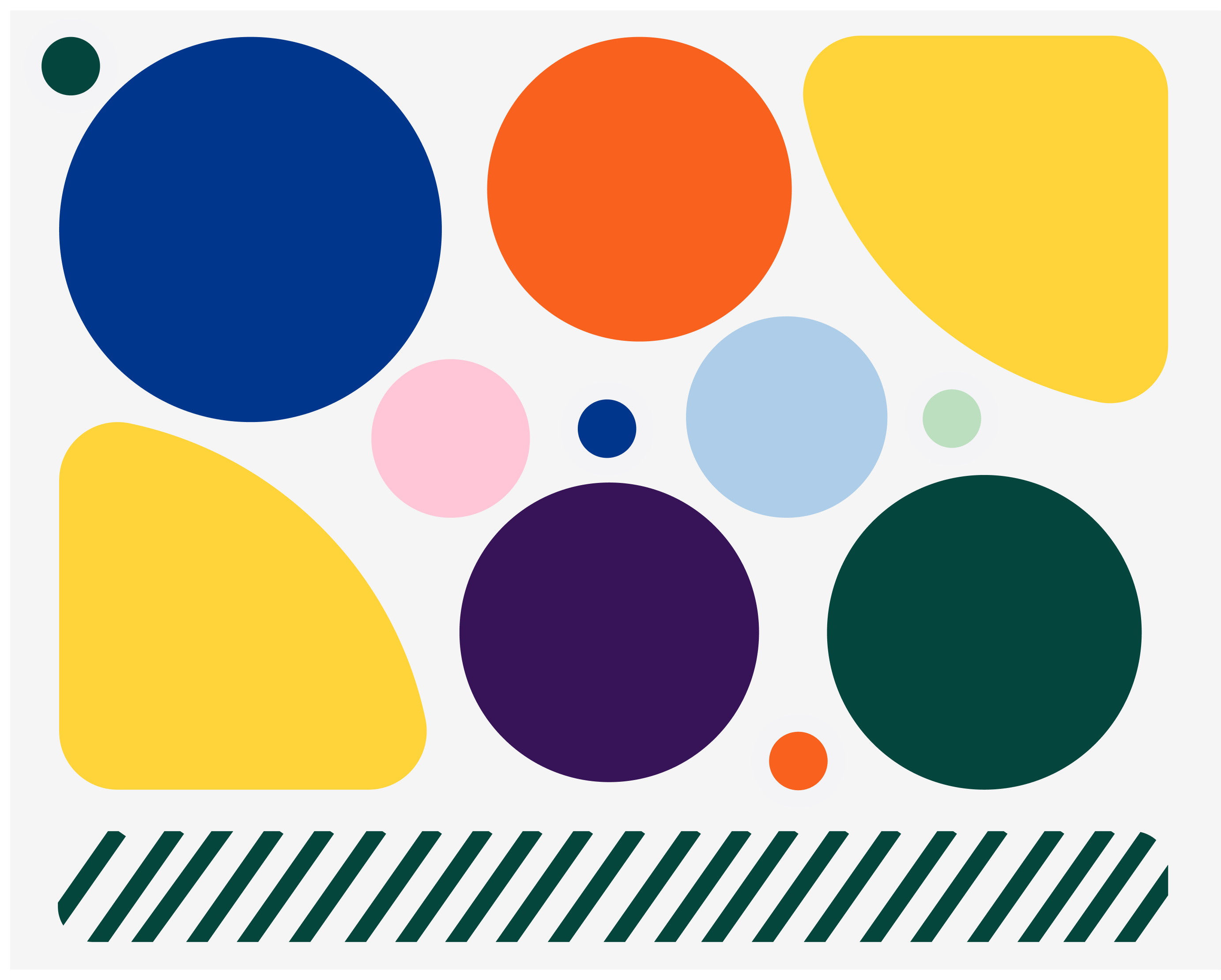
Click anywhere to reveal
WARNING - This tab can cause headaches, dizziness and unsettling vision.
Not accessible
Hard to read for everyone as the colours are harder to differentiate from each other.
Tiring for the eyes, and can cause nausea or dizziness for a lot of users.
Triggering for autistic users.

Learning Disabilities
Autism, some forms of ADHD, dyslexia...
Soft colours are non triggering and distracting
If colour is used to convey meaning, it needs to be clear and accompanied by textual information
Low vision deficiency
Most population over 50 will have colour vision defiency to some level - take this into account depending on your target users
Red, green and yellow are hard to differenciate, so try not to use these colours together
AAA Accessible
Good colour contrast in all content
Colour accomodate most users
This fits accessibility guidelines in most countries
Compliant
Enough colour contrast for content
Doesn’t take into account learning disabilities
Some of the colours used (like the red) are not recommended for accessibility
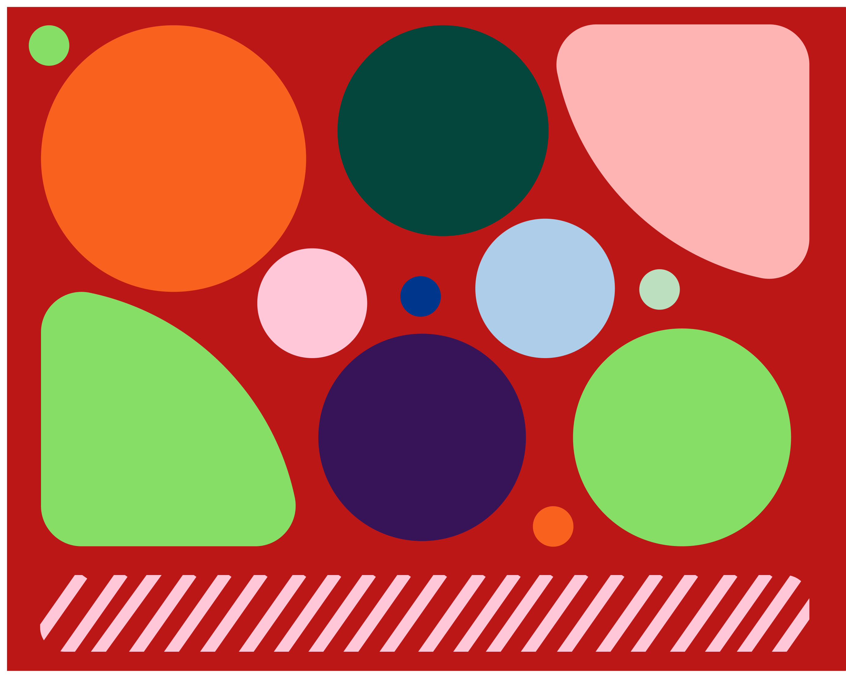
Click anywhere to reveal
WARNING - This tab can cause headaches, dizziness and unsettling vision.
Not accessible
Hard to read for everyone
Tiring for the eyes
Trigerring for Autism
Colours of the same tone/family of color will be hard to differentiate
Quick Tips
Use a contrast colour checker
Not too many colours
Distinguishable key informations
Accessibility
and who it affects
A Accessibility
- Distinguishable Content
- Colour cannot be used alone to convey information, indicating an action, prompting a response, or distinguishing a visual element. A combination of colour, shape and text would be recommended.


AA Accessibility
- Distinguishable Content
- Colour contrast needs to be of at least 4.5:1 (except for large text, incidental/decorative elements or logos). You can check the contrast with a contrast checker online, a plug-in or maths, if you have the time.
- Non-text elements need to have a contrast of at least 3:1.
AAA Accessibility
- Distinguishable Content
- Colour contrast needs to be enhanced to 7:1 (except for large text, incidental/decorative elements or logos).
- The user needs to be able to choose the colour of the text and background through a mechanism.

A Accessibility
- Distinguishable Content
- Colour cannot be used alone to convey information, indicating an action, prompting a response, or distinguishing a visual element. A combination of colour, shape and text would be recommended.
AA Accessibility
- Distinguishable Content
- Colour contrast needs to be of at least 4.5:1 (except for large text, incidental/decorative elements or logos). You can check the contrast with a contrast checker online, a plug-in or maths, if you have the time.
- Non-text elements need to have a contrast of at least 3:1.
AAA Accessibility
- Distinguishable Content
- Colour contrast needs to be enhanced to 7:1 (except for large text, incidental/decorative elements or logos).
- The user needs to be able to choose the colour of the text and background through a mechanism.


Accessibility isn’t meant to impede cool design, but keeping in mind accessibility allows a website to full-fill its purpose: to communicate information correctly to a large amount of people.
Having a slightly different colour palette for web can be a good solution.

Have a look at our other guides

Have a look at our other guides