Interactions
and media.
When designing a website, adding animations and interactions can make your platform more engaging.
Some interactions (such as hover effects) can be used to improve accessibility. However, animations can also be obstructive, so it's important to use them with caution.
Learning Disabilities
Avoid too much movement in general as it can make content confusing and text harder to digest.
Make sure to include clear and simple captions for all visual media.
Make controls, buttons and CTAs visible, clear and easy to use.
Visual Impairments
Make sure any interaction is indicated on some level and can be skipped without losing any content.
Don’t include too many animations or interactions that disturb the navigation or cover essential text.
Be specific when using icons or visuals to convey information or context.
AAA Accessible
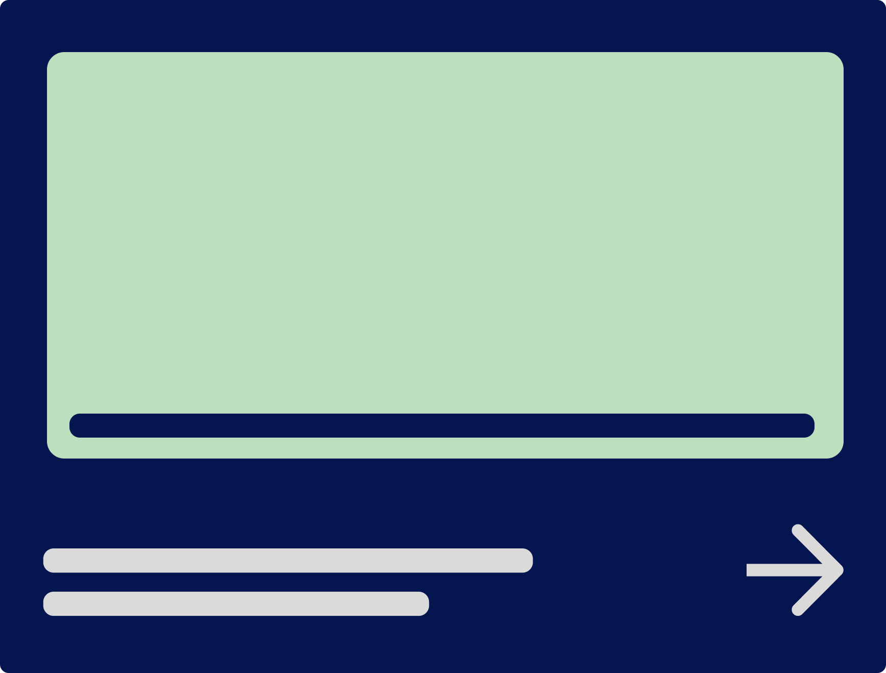
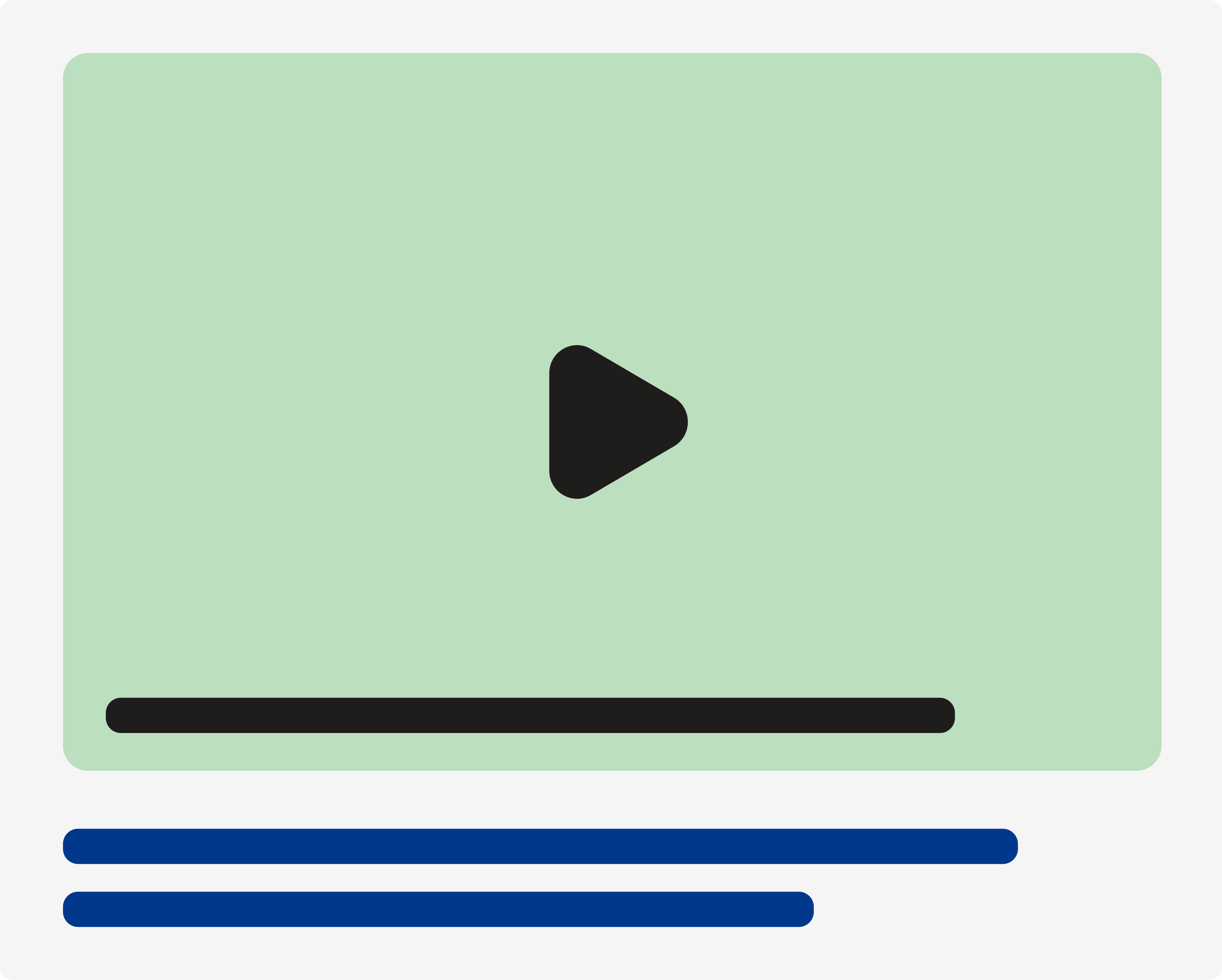
Easy to use and clear controls for media and animations.
Clearly indicated interactions and animation.
Options to stop or skip animation-heavy section.
Compliant
Text alternative for photos and videos help screen readers.
Add warnings or avoid flashes as it can cause epilepsy or can be triggering.
Videos have controls for sounds and pause/play.
Click anywhere to reveal
WARNING - This tab can cause headaches, dizziness and unsettling vision.
Not accessible
Too many animations can be triggering.
Can create bugs and slow down loading time.
No control tools in video or sound.
Screen readers cannot function properly.

Learning Disabilities
Avoid too much movement in general as it can confuse the users and mix-up the words.
Make sure to include proper captions and be thorough with the media used.
Make controls visible, clear and easy to use.
Low vision deficiency
Make sure any interaction is indicated on some level and can be skipped without losing any content.
Don’t include too many animations or interactions that disturb the navigation or cover essential text.
Be specific when using icons or visuals to convey information or context.
AAA Accessible
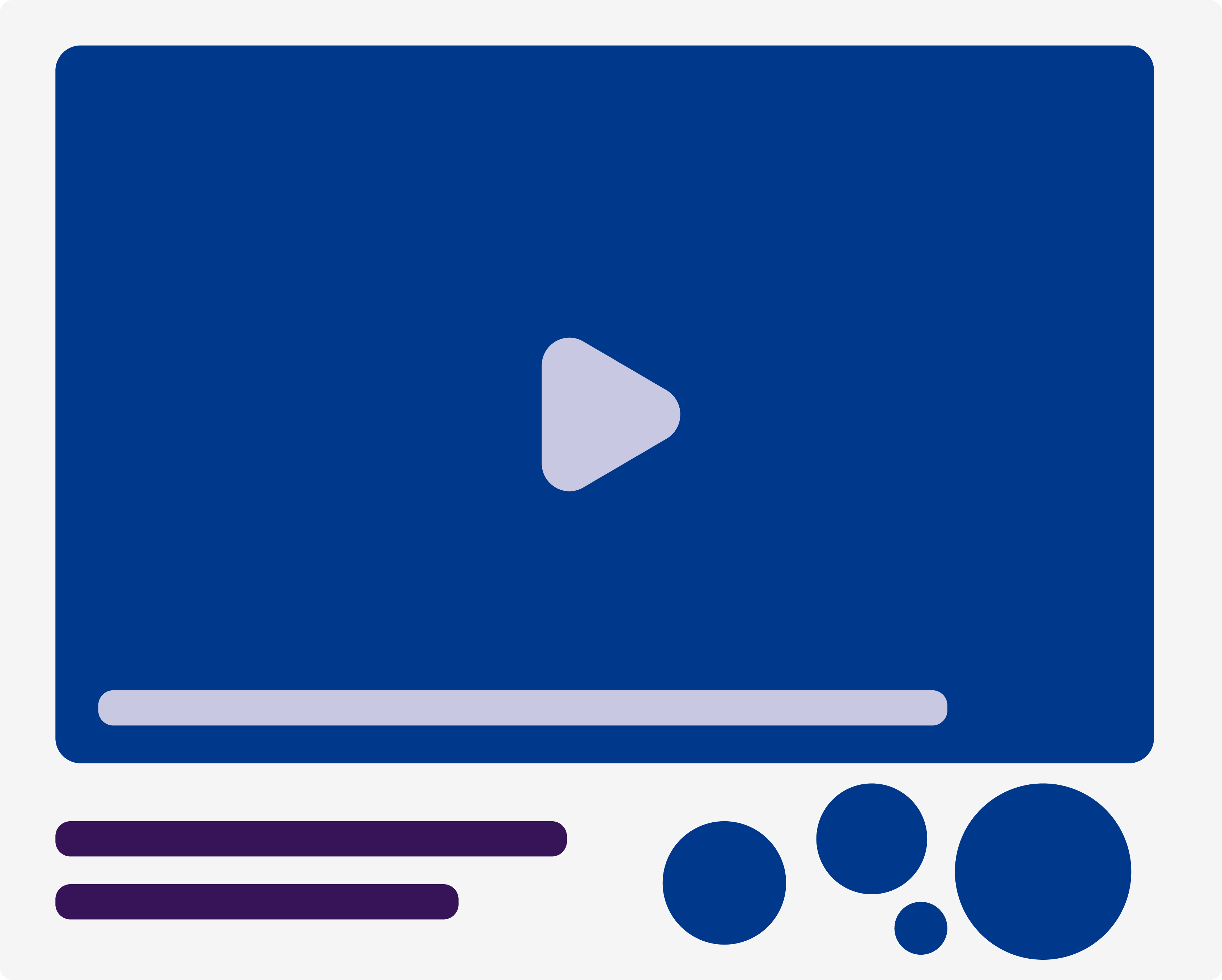
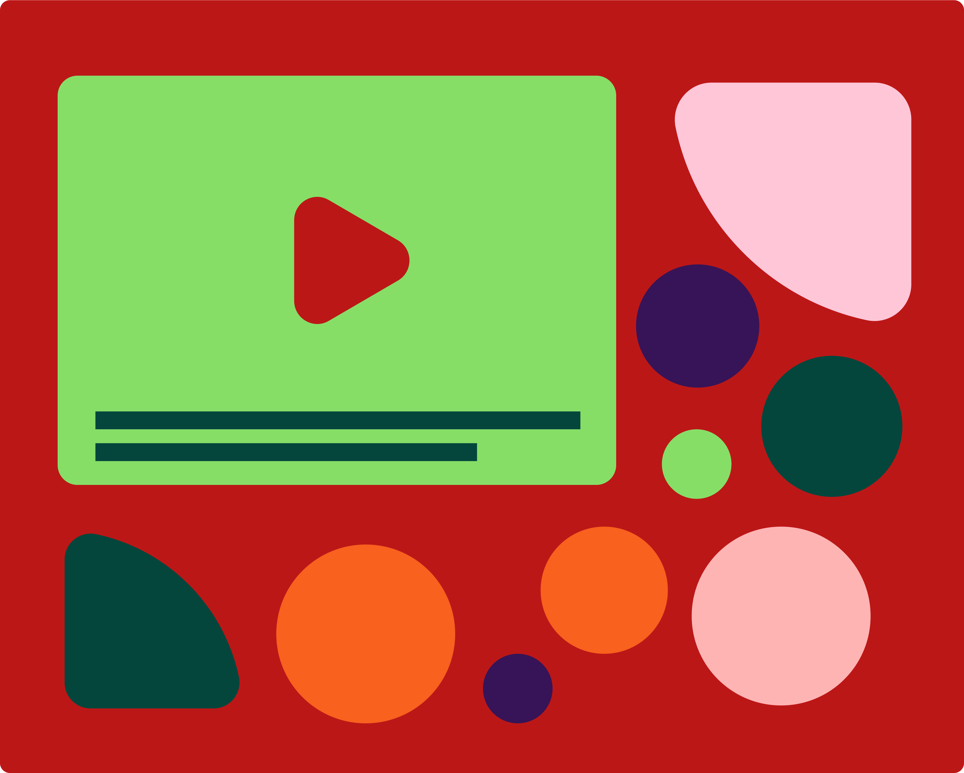
Easy to use and clear controls for media and animations.
Clearly indicated interactions and animation.
Options to stop or skip animation-heavy section.
Compliant
Text alternative for photos and videos help screen readers.
Add warnings or avoid flashes as it can cause epilepsy or can be triggering.
Videos have controls for sounds and pause/play.
Click anywhere to reveal
WARNING - This tab can cause headaches, dizziness and unsettling vision.
Not accessible
Too many animations can be triggering.
Can create bugs and slow down loading time.
No control tools in video or sound.
Screen readers cannot function properly.
Quick Tips
Identifiable interactive elements
Consider control tools
Give alternative text to your media
Accessibility
and who it affects
A Accessibility
- Text alternative for non text content
- Time based media (pre-recorded)
- Enough time
- Adjustable timing
- Option to pause, hide...
- Seizures and physical reactions
- for animations/flashing images, 3 flashes or below
AA Accessibility
- Time Based Media
- Captions (live)
- Audiodescription (pre-recorded)
AAA Accessibility
- Time Based Media
- Sign laguage pre recorded
- Ext. audio description (pre-recorded)
- Media alt (pre-recorded)
- Audio only (live)
- Distinguishable
- Low or no background audio
- Seizures and physical reactions
- 3 flashes
- Disabling option for motion triggered animation
- Readable
- Unusal words (mechanism)
- Abbreviations (mechanism)
- Reading level available
- Pronuciation (easy to identify)


A Accessibility
- Text alternative for non text content
- Time based media (pre-recorded)
- Enough time
- Adjustable timing
- Option to pause, hide...
- Seizures and physical reactions
- for animations/flashing images, 3 flashes or below
AA Accessibility
- Time Based Media
- Captions (live)
- Audiodescription (pre-recorded)
AAA Accessibility
- Time based media
- Sign laguage pre recorded
- Ext. audio description (pre-recorded)
- Media alt (pre-recorded)
- Audio only (live)
- Distinguishable
- Low or no brackground audio
- Seizures and physical reactions
- 3 flashes
- Disabling option for motion triggered animation
- Readable
- Unusal words (mechanism)
- Abbreviations (mechanism)
- Reading level available
- Pronuciation (easy to identify)


When using interaction and displaying media, consider the experience of your user before designing - you can also use content to make your website more accessible!

Have a look at our other guides

Have a look at our other guides