Typefaces and written content.
Choosing the right typefaces can greatly improve accessibility on web.
The style of typeface you use can have a big impact on the audience you are designing for.
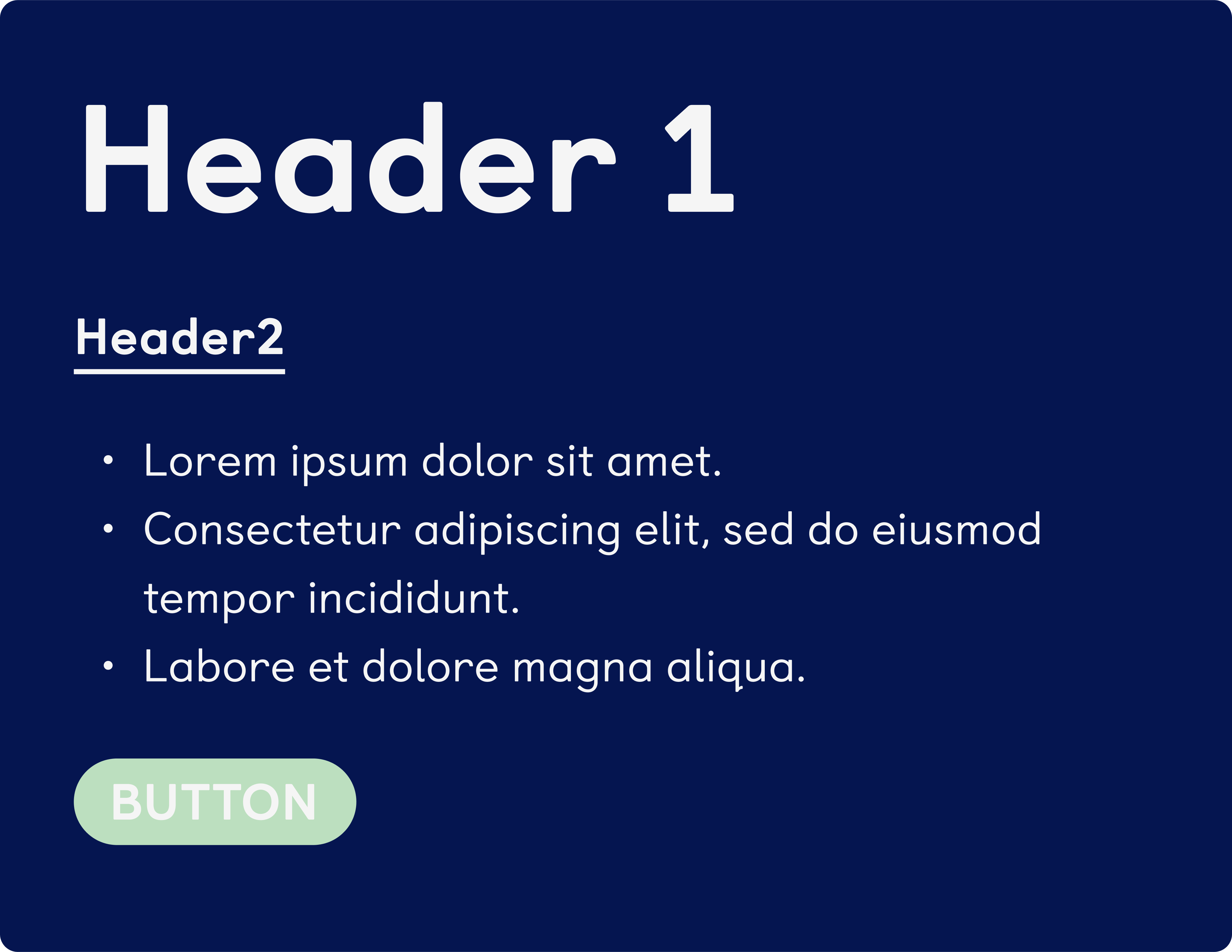
Hierarchy and legibility are the two most important elements when it comes to typography and accessibility.
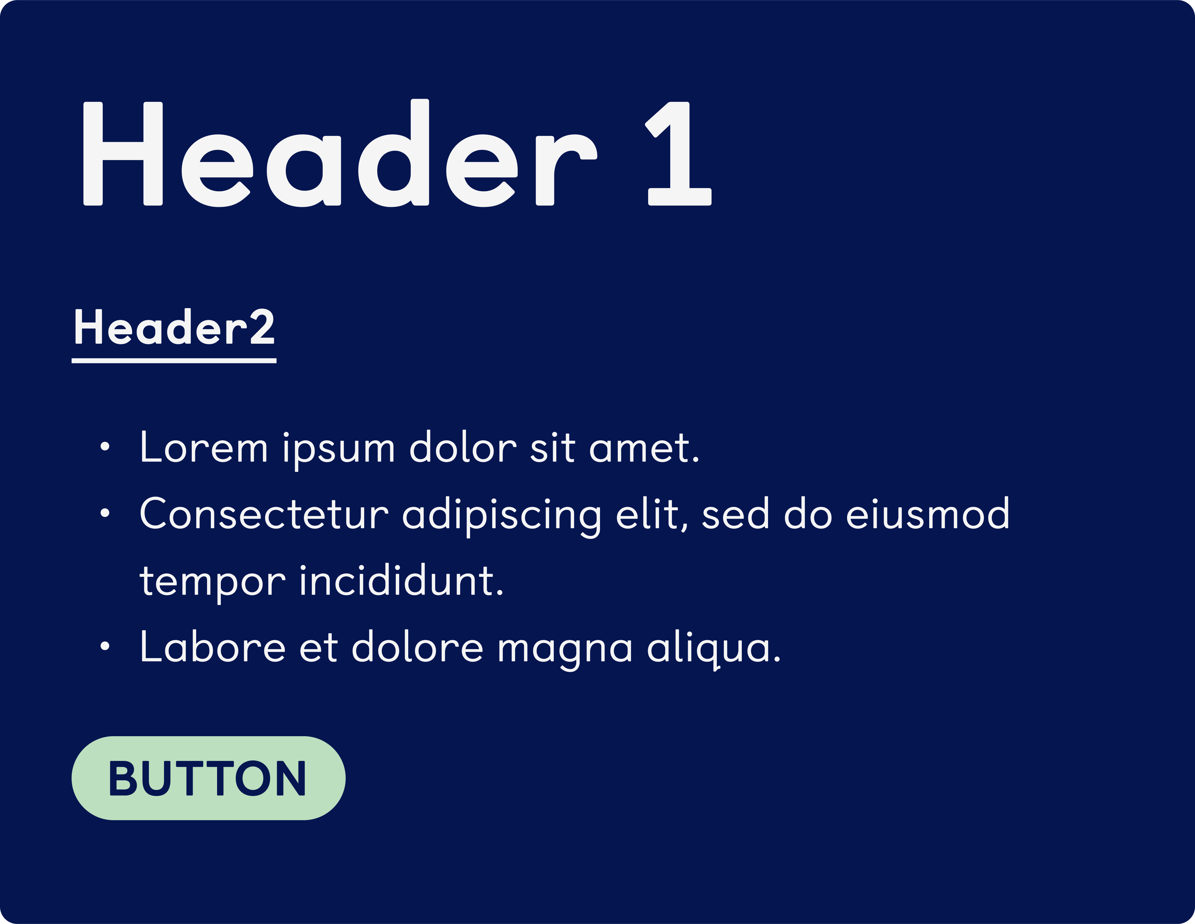
Learning Disabilities
Easier for these users to read rounded fonts and bigger sizes
Use short sentences and a logical layout.
Both titles and body fonts should be legible, clear and easy to read.
Visual Impairments
Distinguishable characters in typefaces (like ascending characters) need to be differentiable from capital letters.
There needs to be a logical hierarchy - some users need to use screen readers.
Be aware of the size of your font.
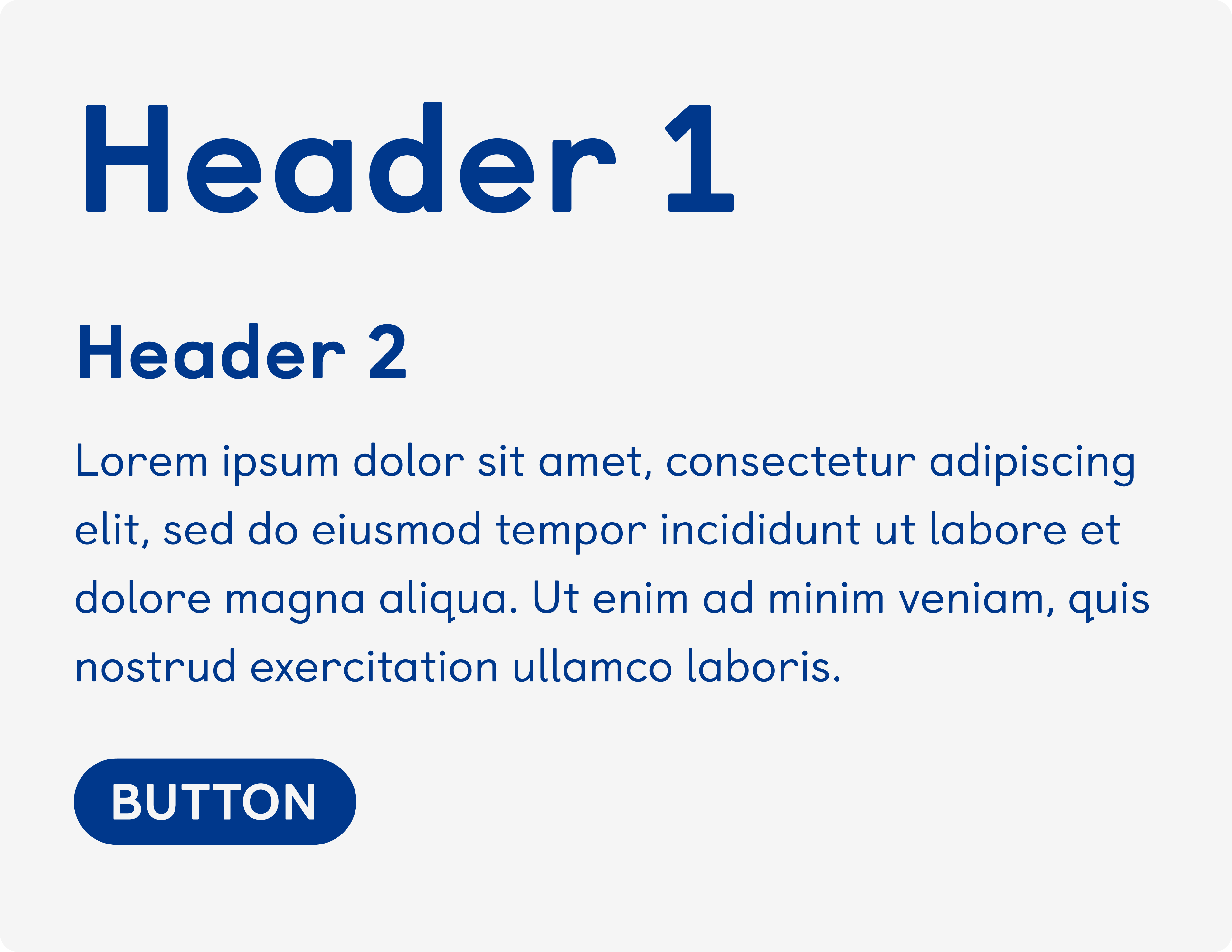
AAA Accessible
Clear and legible body font.
Correct headings, font hierarchy and page naming
Optimal number of characters per line, line height and clear link purpose
Text is easy to understand, no loss of content when making text bigger
Compliant
Pages are correctly titled
Input assistance when users make mistakes
Small text has proper contrast and is in a legible
Click anywhere to reveal
WARNING - This tab can cause headaches, dizziness and unsettling vision.
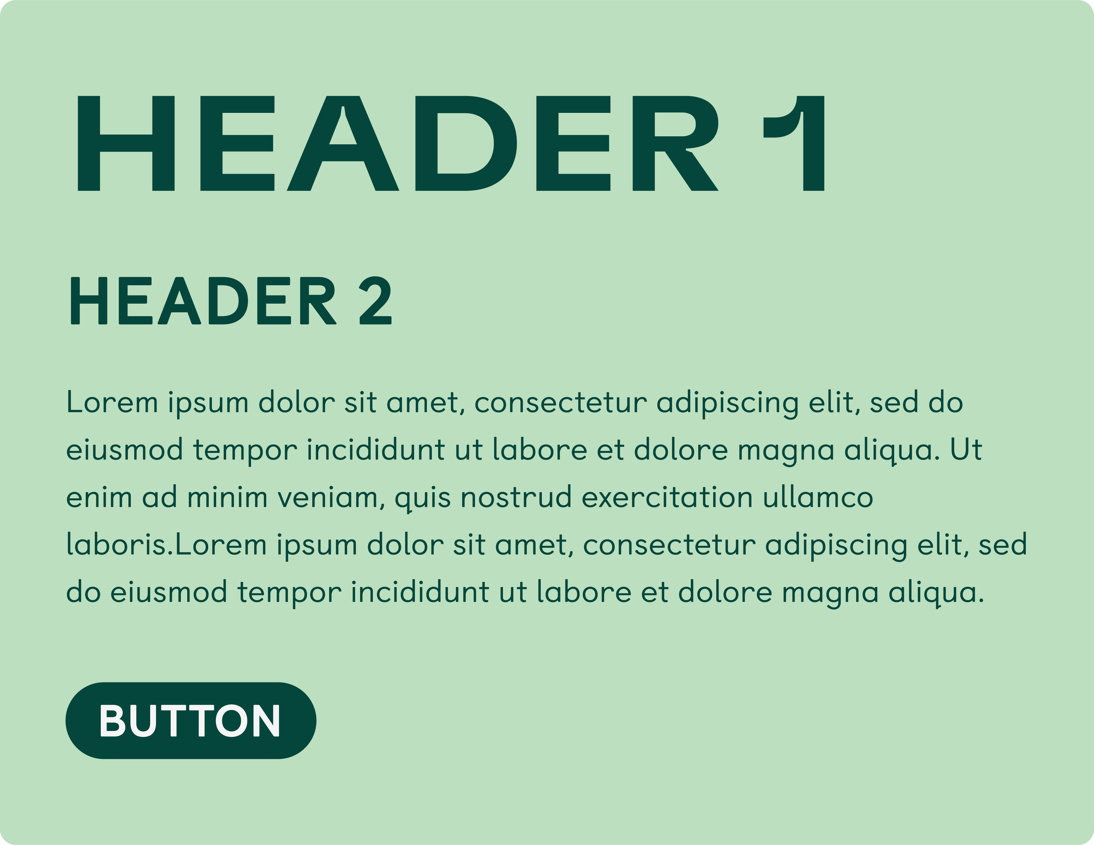
Not accessible
Hard to read for everyone
Fonts aren’t legible, are too small or too big
There is no hierarchy of text and headings
Changing the size of the text leads to loss of content

Learning Disabilities
Easier for these users to read rounded fonts and bigger sizes
Use short sentences and a logical layout.
Both titles and body fonts should be legible, clear and easy to read.
Low vision deficiency
Distinguishable characters in typefaces (like ascending characters) need to be differentiable from capital letters.
There needs to be a logical hierarchy - some users need to use screen readers.
Be aware of the size of your font.
AAA Accessible
Clear and legible body font.
Correct headings, font hierarchy and page naming
Optimal number of characters per line, line height and clear link purpose
Easy understanding on text, translation pronunciation, and no loss of content when making text bigger
Compliant
Pages are correctly titled
Input assistance when users make mistakes
Small text has proper contrast and is in a legible
Click anywhere to reveal
WARNING - This tab can cause headaches, dizziness and unsettling vision.
Not accessible
Hard to read for everyone
Fonts aren’t legible, are too small or too big
There is no hierarchy of text and headings
Changing the size of the text leads to loss of content
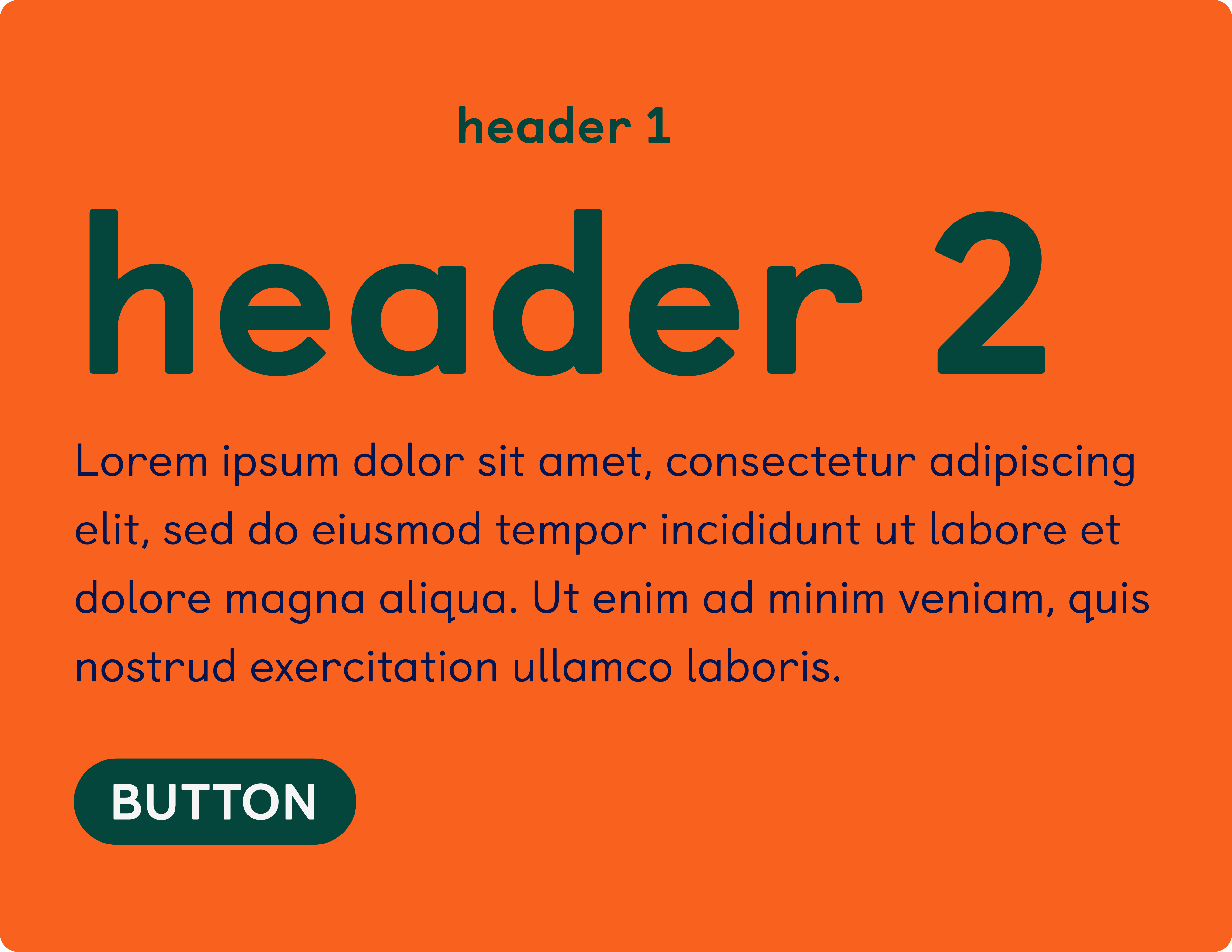
Quick Tips
Use correct headings.
Don’t use font sizes below 13pt.
Choose a readable
typeface.
Optimal number of characters per line.
Test fonts before signing off.
Think of the users.
Imposters
When choosing a typeface, be aware of imposter letters. This is the main thing to look for, as it can really impeach legibility. A tip: write the word “Illustrate” and see how easy it is to differentiate the letters!
The most common imposters are capital letters and ascendants lowercases’s heights- the most important one being the “l” and “I”. Pay attention to the design of numbers as well.


Distinguishable uppercases
Another important element are letters that aren’t distinguishable. For example, the letters “C” and “O” can be hard to distinguish if the “C” is not open enough.
In general these 5 characters are the most important ones to pay attention to when choosing an accessible font.
Mirroring
Mirroring might be the hardest characteristic to find in body fonts. A lot of sans-serif fonts are going to be legible, but will have a lot of mirror-letters, like “q” “p” “d” and “b”.
These matters especially when your audience can be composed of early readers and people with learning disabilities.

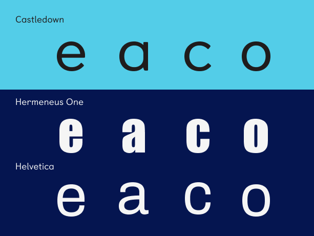
Distinguishable lowercases
Lowercases are usually designed from the same set of modules or details - this means that the letters “a” “e””o” and “c” can look very similar, and can disturb the legibility of a text.
In general, look for characters that aren’t too closed, and when the “a” and “e” aren’t too similar.
Choosing your font
a designer should look for when
choosing a font - specifically a font
used to convey key information and content. These are not official
guidelines.
Imposters
When choosing a typeface, be aware of imposter letters. This is the main thing to look for, as it can really impeach legibility. A tip: write the word “Illustrate” and see how easy it is to differentiate the letters!
The most common imposters are capital letters and ascendants lowercases’s heights- the most important one being the “l” and “I”. Pay attention to the design of numbers as well.
Distinguishable Uppercases
Another important element are letters that aren’t distinguishable. For example, the letters “C” and “O” can be hard to distinguish if the “C” is not open enough.
In general these 5 characters are the most important ones to pay attention to when choosing an accessible font.
Mirroring
Mirroring might be the hardest characteristic to find in body fonts. A lot of sans-serif fonts are going to be legible, but will have a lot of mirror-letters, like “q” “p” “d” and “b”.
These matters especially when your audience can be composed of early readers and people with learning disabilities.
Distinguishable lowercases
.svg)
Lowercases are usually designed from the same set of modules or details - this means that the letters “a” “e””o” and “c” can look very similar, and can disturb the legibility of a text.
In general, look for characters that aren’t too closed, and when the “a” and “e” aren’t too similar.

A Accessibility
- Navigable (users are helped in navigating content)
- Pages are titled in a way that describes their topic and purpose
- Link purpose can be determined by text alone or in context
- Input assistance with mistakes (help users when making mistakes)
- In there is an input error, it can be easily identified
- Labels or instructions are provided when content requires user input.

AA Accessibility
- Distinguishable Content
- Text can be resized without assistive technology up to 200 percent without loss of content or functionality.
- When changing style properties (like text spacing), there should be no loss of content or functionality.
- Navigable
- Headings and labels describe topic or purpose.
- Input assistance with mistakes (help users when making mistakes)
- Error suggestions and preventions.
AAA Accessibility
- Distinguishable Content
- Width of NO MORE than 80 characters
- Text is not justified
- Line spacing is at least x1.5
- Link purpose
- Possibility to explain abbreviations, unusual words, pronunciations.
- Input assistance (help and error prevention).

A Accessibility
- Navigable (users are helped in navigating content)
- Pages are titled in a way that describes their topic and purpose
- Link purpose can be determined by text alone or in context
- Input assistance with mistakes (help users when making mistakes)
- In there is an input error, it can be easily identified
- Labels or instructions are provided when content requires user input
AA Accessibility
- Distinguishable Content
- Text can be resized without assistive technology up to 200 percent without loss of content or functionality
- When changing style properties (like text spacing), there should be no loss of content or functionality
- Navigable
- Headings and labels describe topic or purpose.
- Input assistance with mistakes (help users when making mistakes)
- Error suggestions and preventions.
AAA Accessibility
- Distinguishable Content
- Width of NO MORE than 80 characters
- Text is not justified
- Line spacing is at least x1.5
- Link purpose
- Possibility to explain abbreviations, unusual words, pronunciations
- Input assistance (help and error prevention)


Web designers naturally gravitate towards different and unique fonts, but it's important to hold the reader in mind when it comes to typography. Try to balance form and function. You can have fun with fonts when their purpose is decorative and not to convey key information or site navigation!

Have a look at our other guides

Have a look at our other guides